Blog
Blog Entry #002, Destructive Debinding
Book debinding is finally underway, albeit for only one book at the moment; I don't have spare copies of the rest of my books yet. Unfortunately, I have to spend extra on copies because I neither trust myself with a heat gun nor do I trust the wiring in my outlets to not explode upon turning it on.
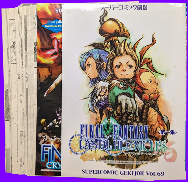
Another unfortunate thing is I forgot to take photos of the debinding process, something I'll have to remember for next time. But basically what I did was open the book at the halfway point, try to flatten it as much as possible and start cutting the book in half. I ended up splitting SuperComic Gekijou into smaller sections to make it easier to debind, unfortunately doing this completely destroys the book's spine. I would not recommend taking an xacto knife to a book unless you really don't care or have another copy of the book you're working on on-hand. I think it took me roughly 30 minutes to debind all 164 pages, though it wasn't entirely without issue: I did end up accidentally ripping some pages a little bit, and the front and end pages were well bound/glued to the covers so I couldn't get those unbound without some damage.
The below image is the final product of a full destructive debind:
I did some test scans and post-processing of the very first page. I've been using NAPS2 because I didn't like how Epson SmartScan handles images: NAPS2 scans the full scanbed at the paper size you select, Epson SmartScan likes to crop the image automatically which I find to be incredibly annoying. However NAPS2 has a habit of over-saturating colour images, which adds to the post-processing. My only other issue with NAPS2 is it really doesn't like letting me scanning at resolutions higher than 1200dpi for some reason, where Epson SmartScan will happily let you scan up to 9600dpi if your scanner can scan at that high of a resolution. There's no winning with either of these damn pieces of software :^)
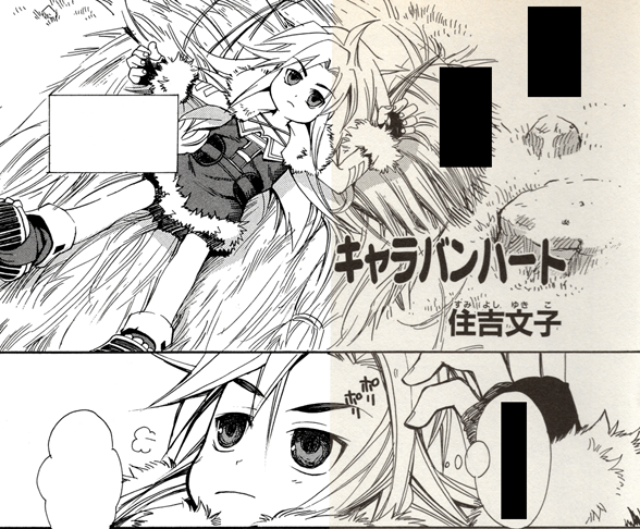
It may be a little difficult to tell, but the left half of the above image is edited; I figured out how to make my black and white scans look as if you're reading them on a digital reader. I remember ages ago on tumblr I read a guide on how to make your lineart look sharp and clean in Paint Tool Sai without actually doing much work. What you do is you copy your image, paste it as a new layer, set the new layer's mode to Overlay and adjust the new layer's colour settings. In my case for this test scan, I set saturation to -100 and contrast to +100. This may or may not work with scans that are heavily yellowed, that's something I'll have to figure out when I get around to scanning Beyond the Endless Sky as my copies are horrendously yellowed.
~Site To Do List~
-Modify and add assets
-Figure out the font situation, not forking out 500$ for a single .ttf file
-Figure out how to implement JavaScript time of day background changing code
-Figure out how to implement mouseover code for the sidebar buttons
-Figure out why cursor code in CSS file doesn't work properly
-Work on documenting merch
-Port over offline/local code
-Maybe clean up the CSS sheet, got too much going on in there imo
-Figure out what to do with this section once to do list is cleared out, maybe make it reflect the in-game stats page?